Overview
Icons are visual symbols representing tools, functions, or content. They quickly communicate ideas or messages through metaphors, draw attention to important information, and are key to usability and intuitive navigation. They may be purely informational or signal to the user interactive elements. In many cases, text labels may be necessary instead of or in addition to unclear or potentially ambiguous icons.
Modus includes both solid and outlined icon sets:
Based on the metaphor they reflect, icons can be divided into three categories ( Jacob Nielsen):
Resemblance icons are the symbols directly depicting a physical object the icon represents. Examples include the magnifier for search, the shopping cart, or the envelope for mail. In order for these icons to be easily recognizable, they need to look like the object they intend to represent.
Reference icons are the symbols depicting an object on the basis of analogy. For instance, a picture of scissors to represent cutting. For reference icons to be successful, the two concepts being linked need to be sufficiently closely related so that the users understand the reference.
Arbitrary icons do not have direct connections with the objects and their recognizability is based solely on convention and power of habit. For example, the question mark denoting “help.” These icons are the hardest for users to learn unless they are widely used and recognized.
Scope
These guidelines are intended to be for only desktop, mobile, and web apps. Future releases of Modus will include additional guidance.
Icon Types
Trimble uses different types of icons to portray relevant information or functionality. Icons can be informational or signal to the user an interactive element. Icons used within interactive elements have hover and active states. Informational icons (charms) usually provide redundant images that reinforce the meaning of adjacent text in order to provide clarity to the user. They are not interactive and have no hover or active states: hovering or clicking on them does nothing. When using both interactive and informational icons in the same interface, it is best to provide a visual distinction between them, so the user knows which icons they can interact with.
Design Principles
- Legible: draw from resemblance (likeness to physical objects), reference (representative of concept), and/or arbitration (conventionally defined meaning) to communicate a concept or action, quickly.
- Scalable: clarity should not be compromised, and an icon’s meaning should translate throughout various sizes and cultural representations.
- Balanced: optically align elements of an icon to create balance of visual weight.
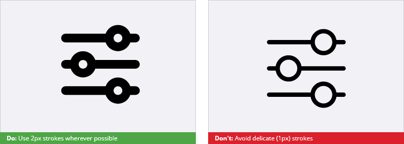
- Unified: maintain consistency of stroke, fill, and sizing.
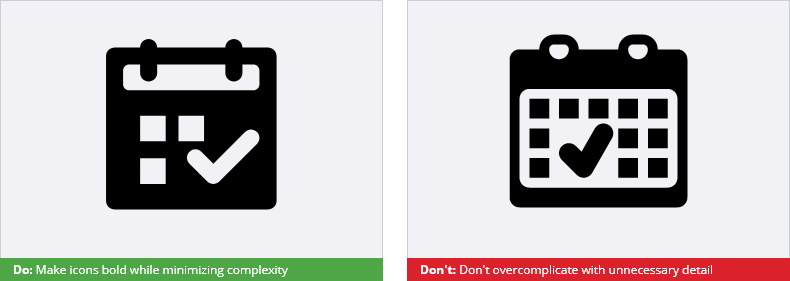
- Simple: focus on designing to the minimal characteristics of objects by leveraging geometric shapes.
- Approachable: consider communicating the brand’s tone and expression by creating positive, emotive connections.
Icon Anatomy, Sizes, and Design Considerations
Trimble uses both solid and outlined icons. The choice should be consistent throughout the product. Be careful when using both solid and outline icons within one UI: make sure that the use is deliberate, context-dependent, and logical. For example, you may use outlined icons to identify interactive icons and solid icons as charms or purely informational icons that are not clickable. For most products outlined icons are preferred. For in-cab software or products used outdoors and/or with heavy gloves, solid icons are better for usability.
The cornerstones of consistent icons:
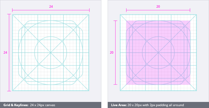
- Canvas Size: pixel space for design of the icon (e.g. Adobe Illustrator artboard). Primary icon size is 24 x 24 px. If the icon glyph has any other shape than a circle or a square, the glyph should be centered on the canvas (avoiding being placed on half-pixels).
- Stroke Weight: outlines of the icon. For legibility, Trimble icons maintain a stroke weight of 2px at the 24 x 24px size. Generally, spacing between two strokes should not be less than the stroke weight. The stroke weights resize accordingly based on the size of the icon (see table below).
- Corner Radius: the radius of the circle created by extending the corner arc to form a complete circle. The corner radius of the icon glyph should be 2px at the 24 x 24px size and should resize accordingly. If the basic overall shape filling the canvas is a rectangle or a square, use 2px rounding of the corners. Smaller elements require adjustments for corner radius following the curvature of a 2 x 2px circle.
- Padding: Padding is defined as negative space around the symbol inside of the canvas. Padding is used to help optically size icons and should not be used to scale icons within a container.
- Optical Sizing: Icons should be designed to include overshoot for optical sizing. For example, a circle icon sized at 24 x 24px will appear smaller next to a square icon of the same dimensions. The square icon should be sized down to 22 x 22px in order to appear visually balanced with the circular icon(see grid below).
- Margin: negative space around the symbol outside of the canvas that contributes to the tap target area. Margins around icons may vary depending on the size of the icon and the UI platform. On web and mobile platforms the size of the margin of the icon should result in a tap target no smaller than 48px (see “Mobile Tap Targeting” below).
There are a few options for icon sizes that you can choose based on your product, the context in which they are used, digital platform, and/ or user preferences. Use no more than 2-3 sizes in one application.
| Canvas Size/ Icon Size | Stroke Weight | Note |
|---|---|---|
| 12x12 - 14x14px | 1px | Used as charms in browsers, dropdowns, tablets, etc. |
| 16x16px | 1px | |
| 24x24px | 1-2px | Primary icon size Main outline 2px/ 1px for object details. |
| 32x32px | 2px | |
| 48x48px | 3px | |
| 64x64px | 4px | Use for program logos, toolbars |
| 96x96px | 6px | Usually thumbnails, web charms, etc. |
Other design considerations:
- All icons should be unique and not redundant with any existing icons in the system (search the library first for keywords associated with the proposed new icon to make sure it’s not already represented).
- Always design on grid: avoid half-pixel stroke to ensure crisp and high quality scaling.
- Inspect your final icon for any superfluous anchor nodes (e.g. nodes on straight lines due to cutting shapes, broken curves, etc.) and fix/smooth/remove accordingly.
- To keep angle consistent, it is recommended to keep diagonal lines on a 45 or 25 degree angle, if possible.
- To ensure exchangeability of vector code, stroke should be converted to outline stroke. Icons cannot change from solid to outlined or outlined to solid when changing states.
- All icons should comply with our accessibility guidelines.
Mobile Tap Targeting
When designing for mobile, space around each icon (margin), should allow for a tap target of at least 48px for ease of selection and error prevention. The tap target size will depend on the context of use: for example, if the app is used when the user is moving and/ or wearing gloves, targets will be more difficult to hit as precise manipulation is not going to be possible. Consider making the tap target bigger to allow more room for error.
Colors
Icons should appear in a single color with no background shape, and should be high contrast. All icons should meet accessibility standards. Web Content Accessibility Guidelines factor in font size and contrast for determining accessibility.
Generally speaking, color should be avoided and icon sets should be designed to appear neutral. They can be two-tone with the use of transparency to make the fill lighter. Some icons may be required to be reversed out for health and human safety, particularly in the case of field hardware. If an icon or indicator cannot be designed using a single color, please follow the below guidelines. If integrating color, never use it as the sole differentiator between functions (e.g. addition or subtraction icon).
Add-Ons & Indicators
Add-ons and indicators provide more specificity to a standard icon or indicate an action a user can perform directly related to the action of the icon proper (e.g. add, remove, alert, close, etc.). The add-on icons usually appear in the bottom right corner. The icon’s design will sometimes dictate an alternate placement of the add-on.
Indicators appear in the upper right corner of the icon and usually represent an alert or notification related to the icon’s meaning. On a 24 x 24px canvas the indicator measures 8px in diameter flush with the edges of the canvas.
Accessibility
Text Alternatives
Providing a textual alternative for images is the first principle of web accessibility. Alternative text can be presented as an alt attribute of the icon, a label, or as the context or surroundings of the image. It serves several functions:
- It is read by screen readers in place of images allowing the content and function of the image to be accessible to those with visual or certain cognitive disabilities.
- It is displayed in place of the image in browsers if the image file is not loaded or when the user has chosen not to view images.
- It provides a semantic meaning and description to images which can be read by search engines or be used to later determine the content of the image from page context alone.
Every image must have an alt attribute. This is a requirement of HTML standard (with a few exceptions in HTML5). Images without an alt attribute are likely inaccessible.
The alt attribute should:
- Be accurate and equivalent in presenting the same content and function of the image.
- Be succinct. Correct content (if there is content) and function (if there is a function) of the image should be presented as succinctly as is appropriate. Typically no more than a few words are necessary.
- NOT be redundant or provide the same information as text within the context of the image.
- NOT use the phrases “icon of …,” “image of …” or “graphic of …” to describe the icon. It is usually apparent to the user that it is an icon.
- NOT describe the icon as a link. Screen readers already identify links. To use the phrase “link to … “ would be redundant.
In some cases, icons may be given an empty or null alt attribute (i.e., alt=""). The null alt attribute is appropriate when:
- The icon is merely decorative and doesn’t convey additional content or function.
- An icon label is provided as part of the icon component. If the icon has both alt text and a label, the screen reader will read it twice.
Recognizability
Icons need to be simple, and they need to be easily understood. They almost always require familiarity in order to be useful. Also, they run the risk of being misunderstood especially across cultures. For icons to be successful for communicating information and navigation, they must be well-designed, easy to understand, and used consistently.
Do not use one icon to represent two different actions. Do not use two different icons to represent the same action.
Color & Contrast
As with text, icons must meet the minimum contrast requirements. WCAG 2.1 requires a contrast ratio of at least 3:1 for graphics and user interface components (such as icons). Icons smaller than 32x32 pixels should aim for the highest possible contrast to meet WCAG AAA requirements (7:1 contrast ratio).
Pixelation of Enlarged Images
Some users with low vision use programs that enlarge the elements on their screen so that they can more easily see them. When images are enlarged, they can become pixelated and more difficult to read. Whenever possible, use vector icons (.svg, .xaml) rather than bitmaps (.gif, .png, .ico, .bmp).
Animations & Transitions
As a rule, do not use animated icons. In rare circumstances an icon might need to be animated in order to enhance usability. If an icon must be animated, the animation should be user controlled or very short in duration. Images that continually animate can cause the rest of the page to be more difficult, or for users with very high levels of distractibility, completely inaccessible. WCAG 2.0 Success Criterion 2.2.2 (Level A) requires that automatically moving, blinking, or scrolling content that lasts longer than 5 seconds can be paused, stopped, or hidden by the user.
In web and mobile applications, icons can have subtle transitions when changing state on hover or click. Transitions should be short in duration.
Icon File Formats
| Technology | File Format | Note |
|---|---|---|
| Vector | .svg .xaml .ttf | .svg is the preferred format. Some technologies such as WPF do no support the use of .svg thus conversion to .xaml code is needed. |
| Bitmap | .png .gif | Avoid bitmap formats to ensure best quality. |
Note! Source files exist as vector graphics (Adobe Illustrator .ai, .pdf) and can be exported to common vector and pixel graphic formats. If pixel graphics are still used in the UI, the source file should already be scaled and retouched as a vector accordingly, not as a pixel graphic.
Contribution Process
Can’t find an icon you are looking for? Follow the design principles, specifications, sizing, and file formats outlined above and submit the icon to Modus to be added to the library.