Overview
Tooltips are overlaid on the primary object of attention for the user. They extend information truncated or vague to allow users to take informed decisions.
Tooltips remain informative and should not be considered actionable.
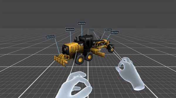
In XR they are also used to provide insight into a virtual object thorugh tooltips that are bound/anchored/attached to a model’s part. Use them as well to provide insight into a real object, which has been identified or was previously embedded in the device’s memory.
In the case of truncated interface texts, tooltips complete information, so that users can take a decision or start an action. These are triggered through interactions like proximity, gaze or hover and are therefore temporary.
Usage
Use when
- Providing a short description of a page element or control.
- Revealing the full text of truncated data.
- The information is essential for the user. For non-essential information, consider using plain text messages.
Don’t use when
- Providing a description longer than 10 words.
- Needing an ancillary button that requires more information. Use voice command hints instead.
Types
| Example | Type |
|---|---|

| Object Tooltip |

| UI Tooltip |