Overview
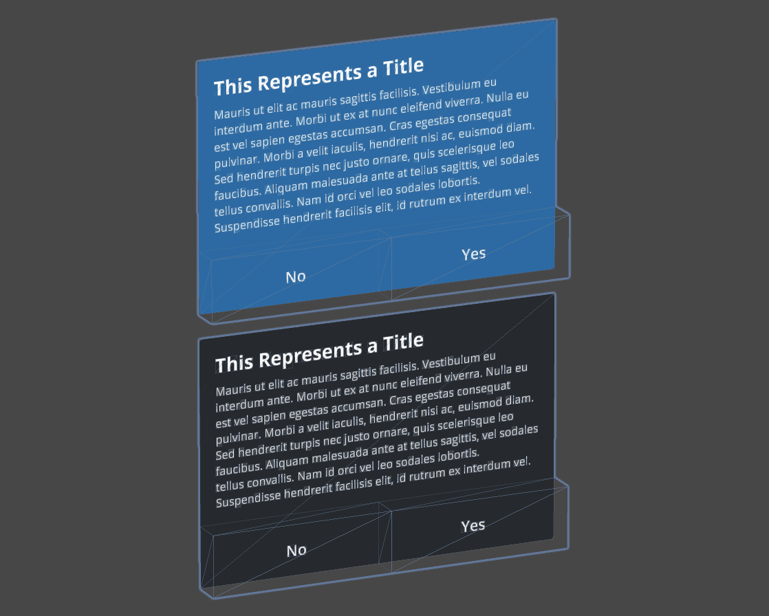
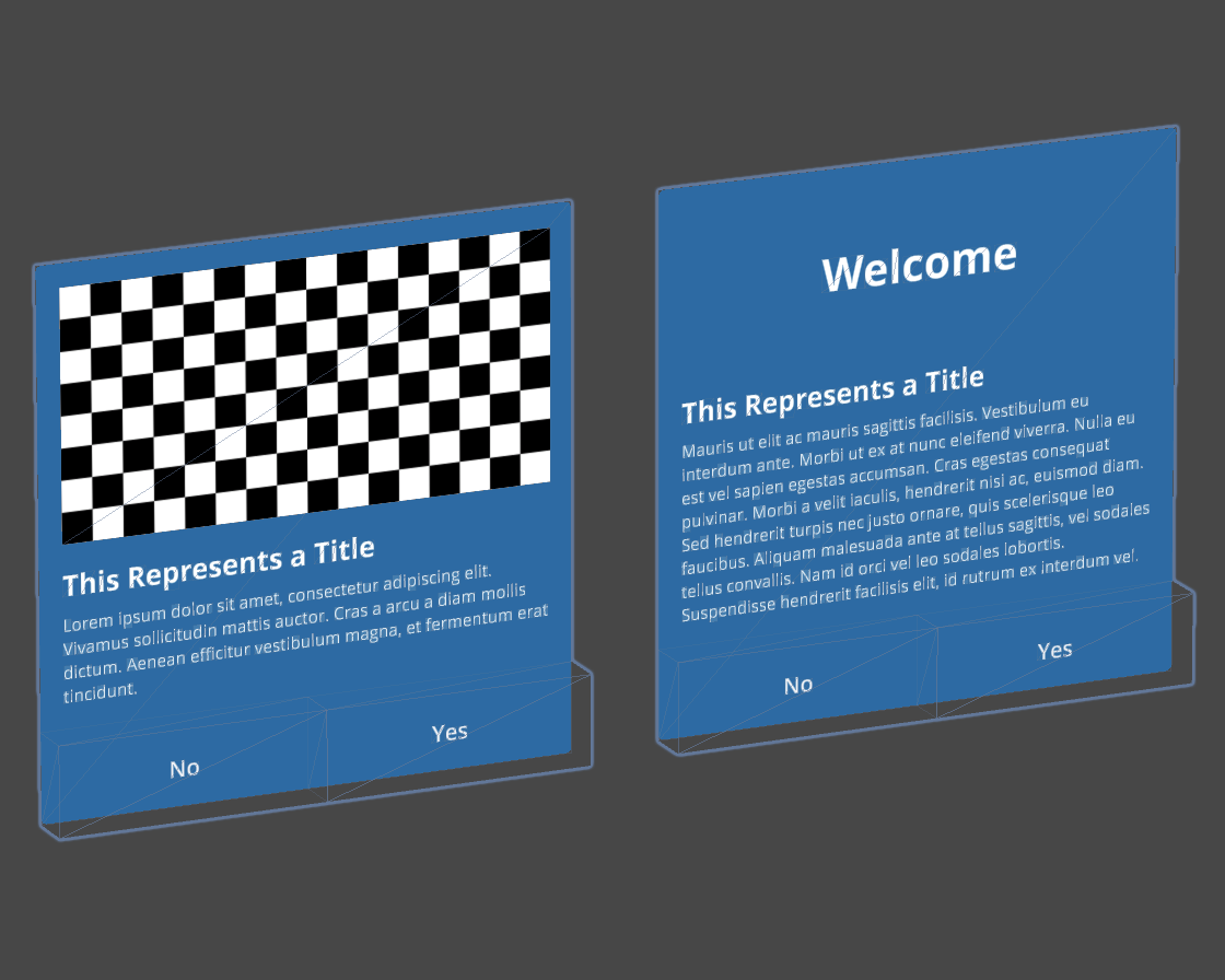
Modals are overlaid on the primary environment the user is in. They interrupt the user, informing about processes, and in most cases requiring a user action. Modals overlay on the main content until the user takes the recommended action or interacts with the modal.
When modals are used within the context of other interfaces these are inert: users cannot interact with content outside an active dialog. Inert content outside an active dialog should be visually obscured or displaced beyond reach to direct the users’ attention to the dialog.
Because dialogs are highly disruptive to the user experience, they should be used sparingly, only when user’s interaction is required to continue.
Usage
Use when
- Showing errors that block an app’s normal operation.
- Critical information that requires a specific user task, decision, or acknowledgement is needed.
- Needing far interaction for large and x-large dialogs.
Don’t use when
- Scrollable, complex interaction dialogs.
- Providing non-essential information related to the underlying page. Use plain txt messages instead.
Types
| Example | Type |
|---|---|

| Small Dialog |
| Medium Dialog |
| Large Dialog |

| X-Large Dialog |